> For the complete documentation index, see [llms.txt](https://academy.pentaho.com/llms.txt). Markdown versions of documentation pages are available by appending `.md` to page URLs; this page is available as [Markdown](https://academy.pentaho.com/pentaho-ctools/c-tools/community-dashboard-editor/components/carrier-dashboard.md).
# Carrier Dashboard
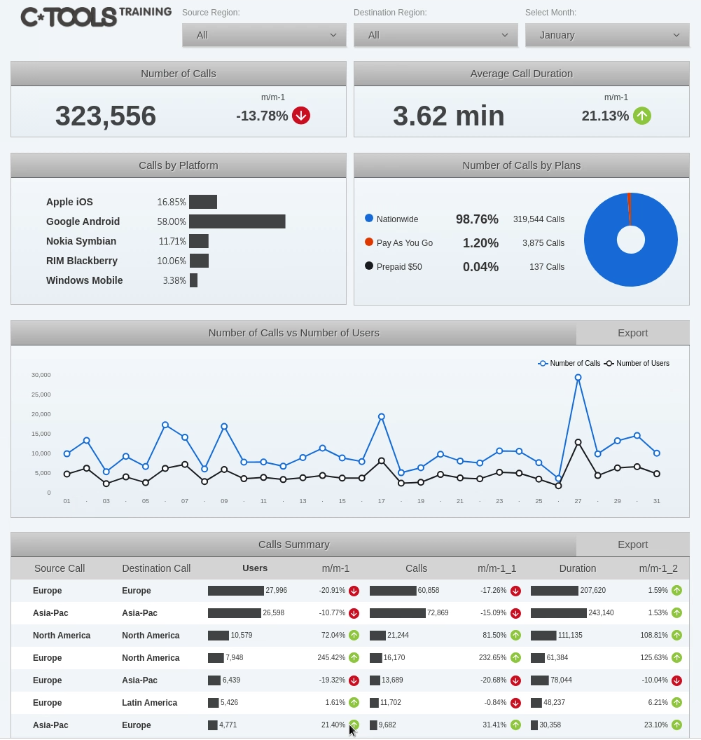
CTools components ..
{% hint style="warning" %}
#### Workshop - Carrier Dashboard Components
Interactive dashboard components are the bridge between raw data and actionable business insights, transforming static visualizations into dynamic analytical applications that respond to user interactions, drive exploration through drill-down capabilities, and enable self-service analytics through intuitive filtering and parameter controls.
In this comprehensive workshop, you'll master the Components perspective of Community Dashboard Editor, learning how to configure sophisticated table components with trend arrows and data bars, create multiple chart types with custom styling and extension points, implement parameter-driven interactivity through listeners and selectors, enable click-based navigation that cascades changes across related visualizations, and provide powerful export capabilities that deliver data and chart images in multiple formats. Building upon the Wireless Carrier dashboard layout and CDA queries from previous workshops, you'll transform a static dashboard skeleton into a fully interactive analytical application that empowers business users to explore telecommunications traffic patterns, filter data across multiple dimensions, and export insights for reporting and presentation.
In this hands-on workshop, you'll experience the complete component configuration lifecycle, starting with basic table creation and progressing through advanced property configuration, pre-execution scripting for custom data formatting, chart component implementation with CCC (Community Chart Components) framework, parameter and listener setup for cross-component communication, selector configuration for user-driven filtering, click action implementation for interactive drill-down, and export functionality for data and visualization sharing. You'll learn how to work with CDE's extensive component property system, configuring both standard properties for basic behavior and advanced properties that unlock sophisticated features including dynamic parameter passing, custom JavaScript functions for complex calculations, cross-component communication through PostExecution functions, and parameterized queries using variables and JavaScript expressions.
As you work through the exercises, you'll master critical techniques including table column type configuration with data bars and trend arrows that provide visual analytics, sprintf formatting functions for number presentation, sort configuration for optimal data display, CCC chart property configuration including colors, legends, and compatibility versions, extension points that enable fine-grained control over chart rendering including slice radius, line width, and axis styling, and the creation of custom resources like bulletLegend that enhance visual communication through color-coded indicators.
**What You'll Accomplish:**
* **Table Component Configuration** - Groups all table setup, data types, formatting, and sorting
* **Chart Types** - Combines pie, line, and bar chart creation fundamentals
* **Extension Points** - Consolidates all advanced chart customization techniques
* **Custom Resources** - Covers bulletLegend and programmatic styling
* **Parameters & Listeners** - Unifies the core interactivity architecture
* **Interactive Selectors** - Groups all filter component configuration
* **Click Actions** - Combines clickable charts and drill-down behavior
* **Export Capabilities** - Merges all export functionality (buttons, popups, formats)
* **Expandable Rows** - Consolidates the advanced table expansion feature
* **Integration** - Brings everything together into cohesive dashboard experience
By the end of this workshop, you'll have transformed the Wireless Carrier dashboard from a static display into a sophisticated, fully interactive analytical application that demonstrates production-ready CTools component development.
You'll understand how to architect component relationships through parameters and listeners, implement user-driven exploration through selectors and click actions, apply advanced styling through extension points and custom resources, and provide comprehensive export capabilities that serve diverse reporting needs.
**Prerequisites:** Completion of Carrier Dashboard Layout and CDA workshops, Pentaho Business Analytics Server with CTools and CDA plugins installed, baseline\_demo database with Wireless Carrier schema configured, familiarity with JavaScript for pre-execution and click action functions\
**Estimated Time:** 60 minutes
{% endhint %}
Wireless Carrier Dashboard
{% tabs %}
{% tab title="Table" %}
{% hint style="info" %}
Let's start by adding the Table components to the dashboard.
{% endhint %}
{% tabs %}
{% tab title="mainTable" %}
{% hint style="info" %}
{% endhint %}
mainTable
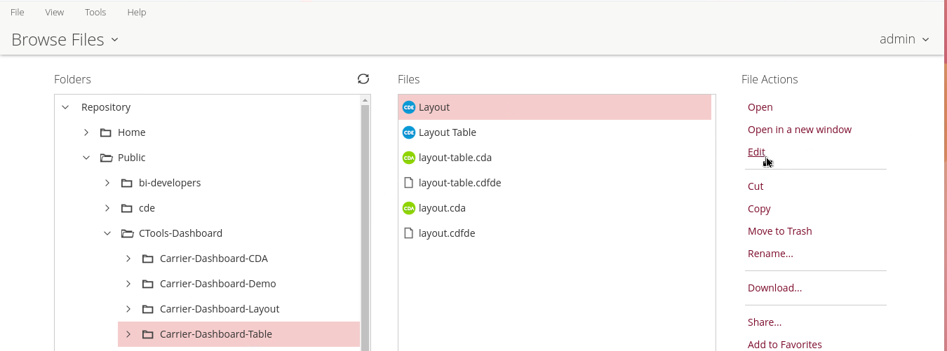
1. Browse to: /Public/CTools Dashboard/Carrier-Dashboard-CDA/Layout
2. Click Edit under File Actions.
3. Click the Components Panel icon.
4. From the Components list, expand Standard, and then click Table Component.
5. Name this table component, in the Properties pane:
• Click in the Value for the Name property.
• Enter: mainTable.
• Press Tab or Enter.
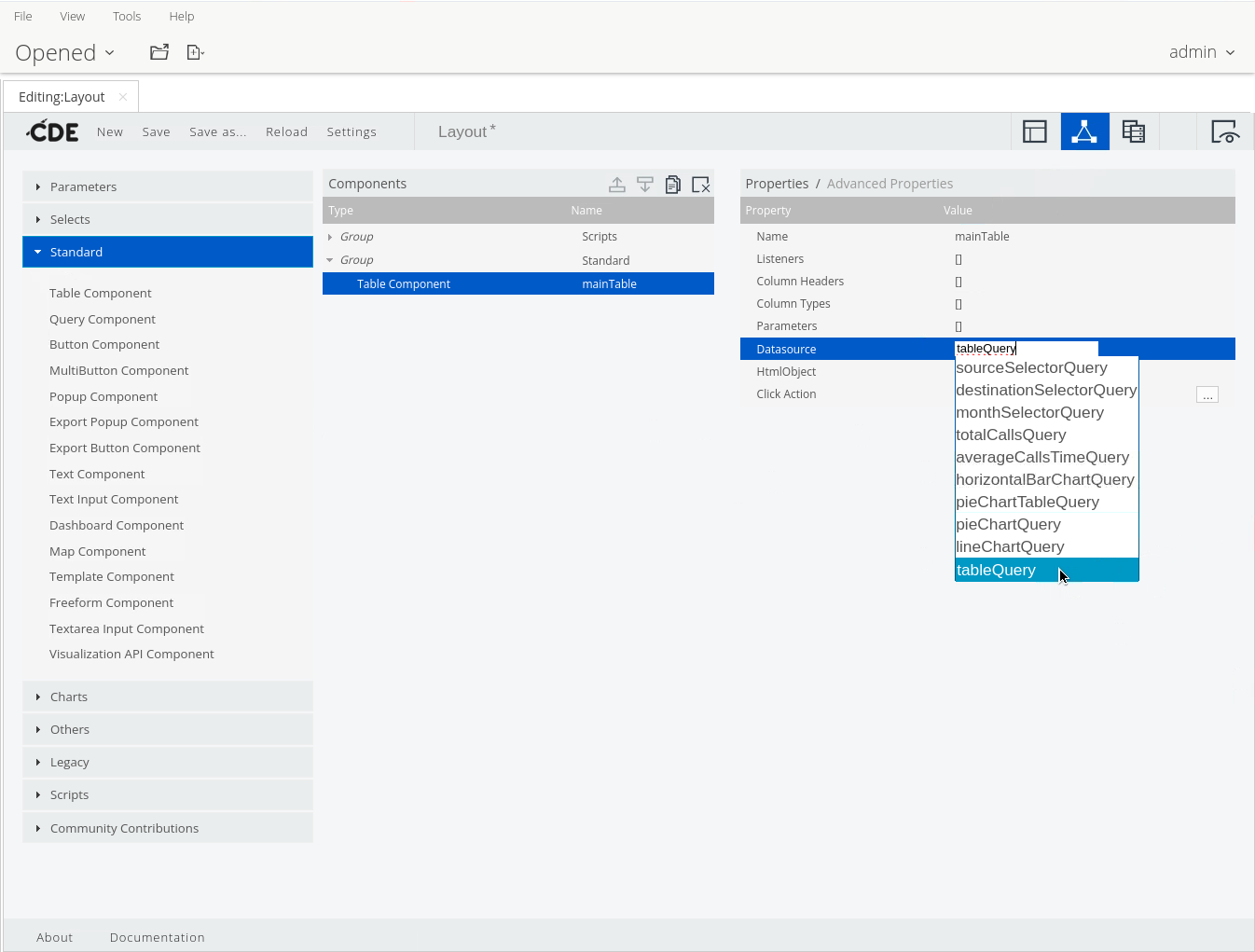
6. Specify the data source, in the Properties pane:
• Click in the Value for the Datasource property.
• On the keyboard, press the down arrow.
• Select: tableQuery.
Select tableQuery as Datasource
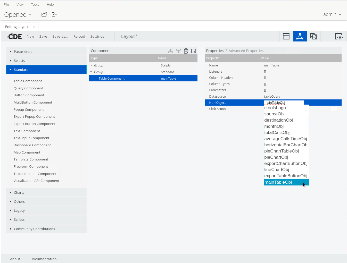
7. Specify the HTML object, in the Properties pane:
• Click in the Value for the HtmlObject property.
• On the keyboard, press the down arrow.
• Select: mainTableObj.
Select mainTableObj
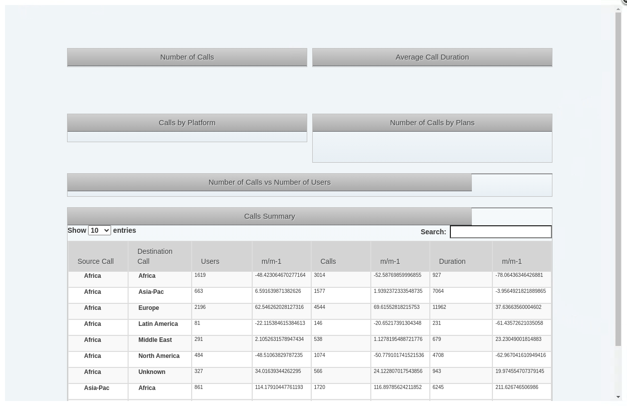
8. Save & Preview the dashboard.
Save & Preview
{% hint style="info" %}
The table doesn’t look exactly like the one in the sample dashboard. In the next several steps we will specify some of the display options, set the page length, add trend arrows and data bars, and format the columns.
{% endhint %}
***
#### Advanced Properties
{% hint style="info" %}
Advanced Properties extend the functionality of the component with features, such as:
• dynamic parameter passing between components
• custom JavaScript functions for complex calculations
• cross-component communication through PostExecution functions
• parameterized queries using variables and JavaScript expressions
{% endhint %}
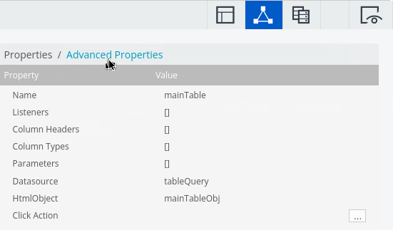
1. To view the advanced properties, in the Properties pane, click Advanced Properties.
Advanced Properties
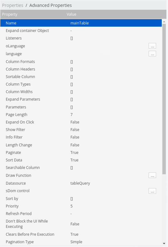
2. Change or set the following properties:
| Property | Value |
| --------------- | ------ |
| Show Filter | False |
| Info Filter | False |
| Page Length | 7 |
| Length Change | False |
| Pagination Type | Simple |
Advanced Properties
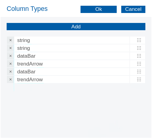
3. Specify the data types for the columns:
• In the Properties pane, click in the Value column for the Column Types property.
• In the new window, click the Add button seven times.
• In the Value columns, enter the following:
{% hint style="info" %}
When entering the values just type the first few letters ..
{% endhint %}
4. Save & Preview the dashboard.
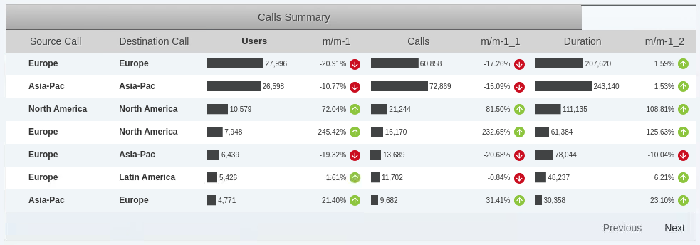
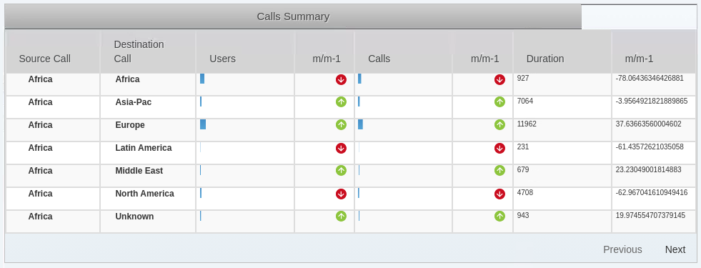
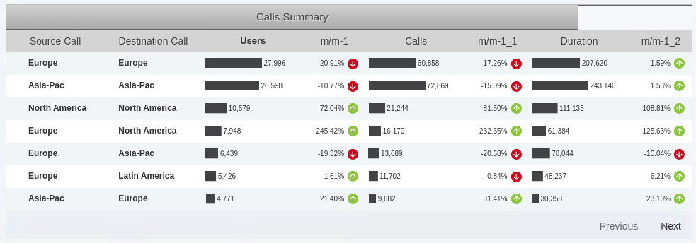
Summary table - would be nice to have values next to Bar Chart ..
{% hint style="info" %}
The data bar and trend arrow columns do not show the data values. We must add pre-execution code to display these values.
{% endhint %}
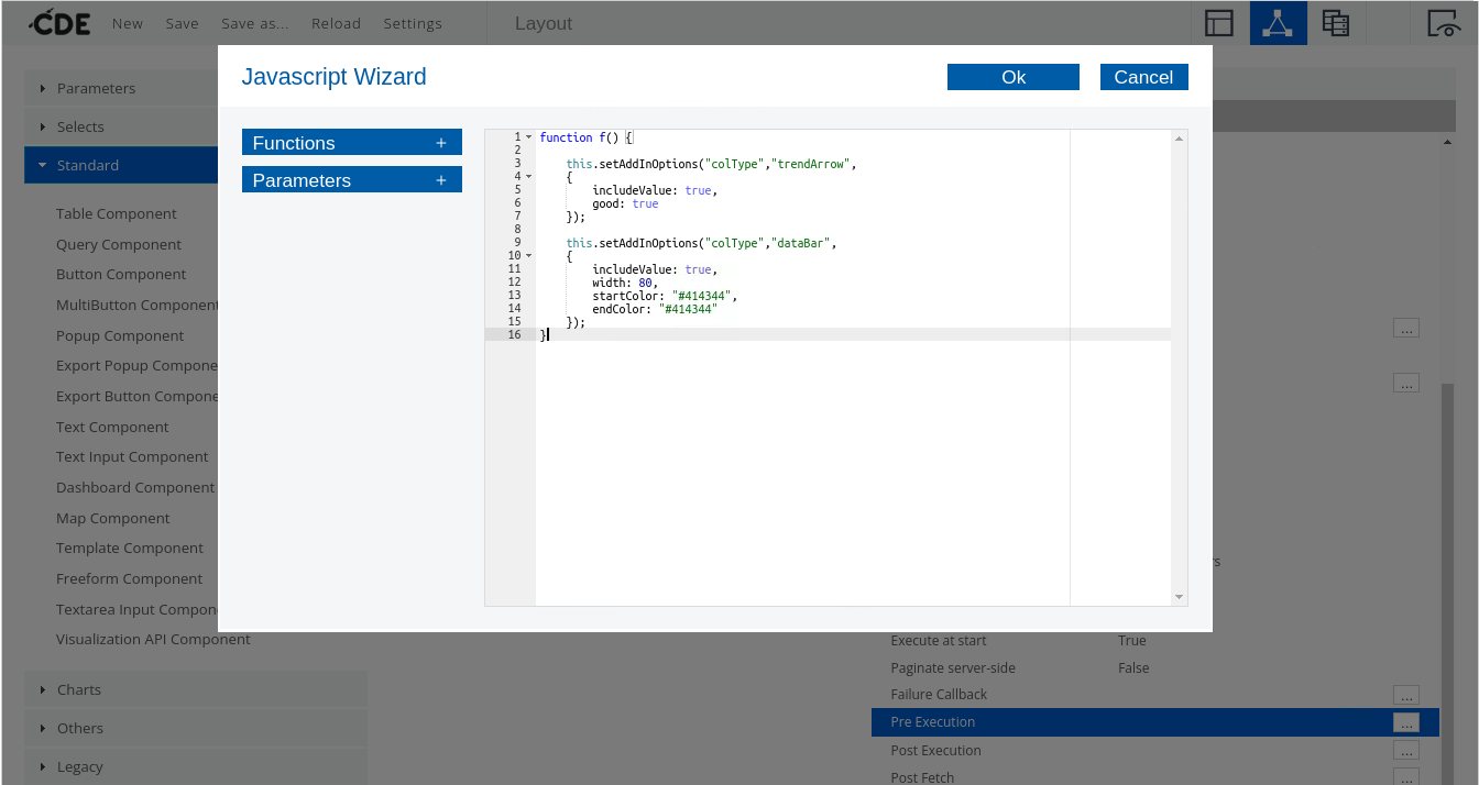
5. Add pre-execution code to display the data values next to the data bars:
• In the Properties pane, click the ellipsis icon to the right of the Pre-Execution property.
• In the Javascript Wizard window, enter the following code, and then click OK:
```javascript
function f() {
this.setAddInOptions("colType","trendArrow",
{
includeValue: true,
good: true
});
this.setAddInOptions("colType","dataBar",
{
includeValue: true,
width: 80,
startColor: "#414344",
endColor: "#414344"
});
}
```
Javascript
6. Save & Preview the dashboard.
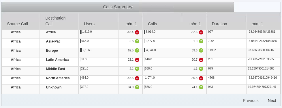
Bar Chart data
{% hint style="info" %}
Great .. the data is now displayed .. however, it does need to be formatted.
Also take a look at Africa .. may wish to address unknown values.
{% endhint %}
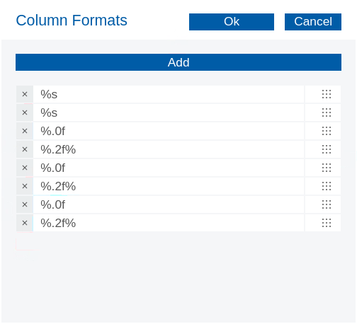
7. Specify the column formats using sprintf functions:
• In the Properties pane, click in the Value column for the Column Formats property.
• In the new window, click the Add button seven times.
• In the text fields, enter the following:
Format Columns
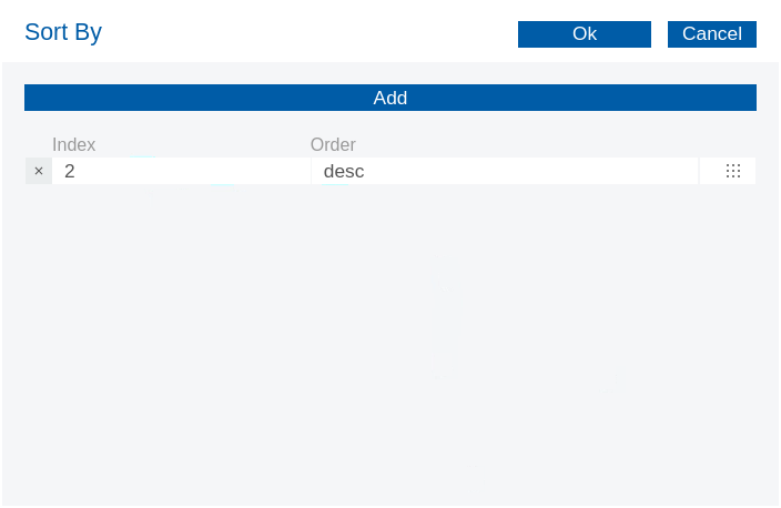
8. Specify the sort order:
• In the Properties pane, click in the Value column for the Sort by property.
• In the Index and Order fields, type the following, and then click OK:
Sort By
9. Save & Preview the dashboard.
Nmbers - Formatted
{% endtab %}
{% tab title="Second Tab" %}
x
{% endtab %}
{% endtabs %}
{% endtab %}
{% tab title="Charts" %}
{% hint style="info" %}
Time for some Charts ..
• connections tested
• the layout has been confirmed
• chart content & types agreed
• dashboard functions included - export graphs & tables, buttons, downloads, etc ..
{% endhint %}
{% tabs %}
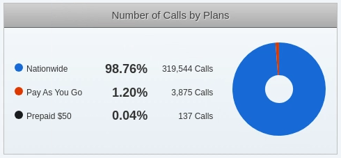
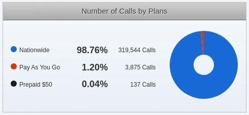
{% tab title="Pie Chart" %}
{% hint style="info" %}
Let's start with the Pie Chart.
{% endhint %}
1. From the Components list, expand Charts, and then click CCC Pie Chart.
2. To name the pie chart, in the Properties pane:
• Click in the Value for the Name property.
• Type pieChart.
• Press Tab or Enter.
3. To specify the data source, in the Properties pane:
• Click in the Value for the Datasource property.
• On the keyboard, press the down arrow.
• Select pieChartQuery.
4. To specify the HTML object, in the Properties pane:
• Click in the Value for the HtmlObject property.
• On the keyboard, press the down arrow.
• Select pieChartObj.
5. To specify the width and height for the pie chart, in the Properties pane:
• Click in the Value for the Width property.
• Type 140 and press Enter.
• Click in the Value for the Height property.
• Type 140 and press Enter.
6. Specify the CCC version, in the Properties pane:
• Click in the Value for the Compatibility version property.
• Type 2.
• Press Tab or Enter.
{% hint style="info" %}
The Compatibility version must be set because the latest version of CCC includes a different set of default properties.
{% endhint %}
7. Click on Advanced Properties
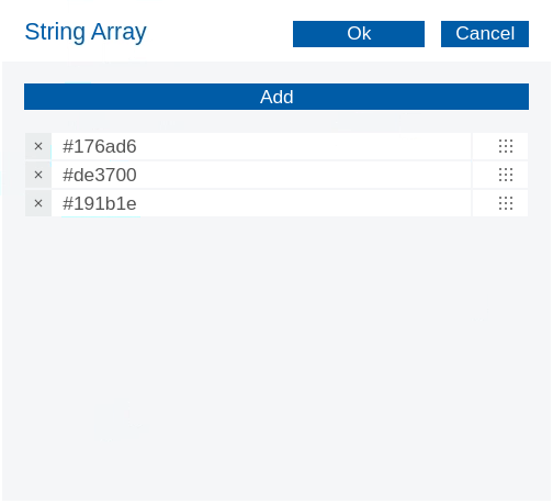
8. To specify the colors for the pie chart:
• In the Properties pane, click in the Value column for the colors property.
• In the new window, click the Add button two times.
• In the text fields, type the following and then click OK:
```
#176ad6
#de3700
#191b1e
```
Pie Chart colours
9. To hide the values, in the Properties pane:
• Click in the Value for the valuesVisible property.
• On the keyboard, press the down arrow.
• Click False.
***
#### Extension Points
{% hint style="info" %}
Extension points in Pentaho CTools are predefined locations in the CTools framework where developers can add custom functionality without modifying the core code. They act as hooks that allow you to extend and customize dashboards and components.
The main types of extension points in CTools include:
1. Component Extension Points: Allow you to extend existing components or create new components. These let you add custom properties, modify behavior, or create entirely new visualization types.
2. Dashboard Layout Extension Points: Enable modifications to the dashboard structure and layout system. You can add custom layout types or modify how components are arranged.
3. Lifecycle Extension Points: Hook into different phases of the dashboard lifecycle, such as initialization, refresh, or cleanup. These are particularly useful for adding custom logic that needs to run at specific times.
{% endhint %}
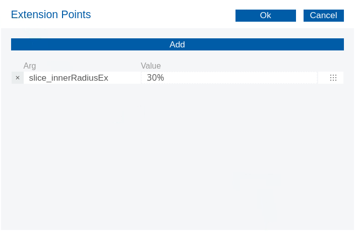
4. Customize the line chart with extension points:
• In the Properties pane, click in the Value column for the Extension Points property.
• In the new window, click the Add button.
• Complete the Arg and Value columns with the following, and then click OK:
Slice Pie Chart - Donut
| Property | Value |
| -------------------- | ----- |
| slice\_innerRadiusEx | 30% |
***
#### Resources
{% hint style="info" %}
Finally we need to add a script that picks up the chart colors and adds them before the Legend.
{% endhint %}
1. To add a bulletLegend script, click Resources.
2. In the Properties pane, enter: bulletLegend.
3. Copy & paste the following script.
4. Save & Reload the dashboard.
```javascript
require([
'cdf/AddIn',
'cdf/Logger',
'cdf/Dashboard.Clean',
'cdf/lib/jquery',
], function(AddIn,Logger, Dashboard, $) {
var bulletLegend = {
name:"bulletLegend",
label:"Bullet Legend",
defaults: {
/* default colors, replace in preExecution */
colors: ["#F00", "#0F0", "#00F"]
},
implementation: function(tgt,st,opt){
Logger.log("Starting addin");
var color = opt.colors[ st.rowIdx % opt.colors.length ],
container = $('').addClass('bulletContainer'),
bullet = $('').addClass('bullet').css('background-color' , color),
//text = opt.textFormat.call(this, st.value, st, opt);
text = st.value;
container.append(bullet).append(text);
$(tgt).empty().append(container);
}
};
Dashboard.registerGlobalAddIn("Table", "colType", new AddIn(bulletLegend));
});
```
{% hint style="info" %}
The function calls inbuilt CDF libraries to add the bulletLegend in a \
container. If you have changed the default table colors then you will need to update
{% endhint %}
5. Preview the dashboard.
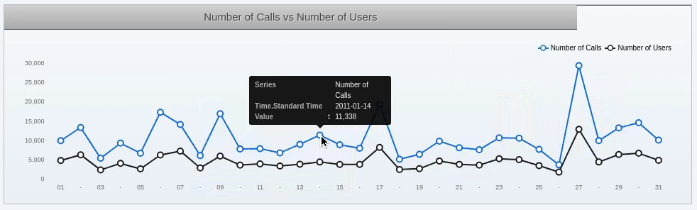
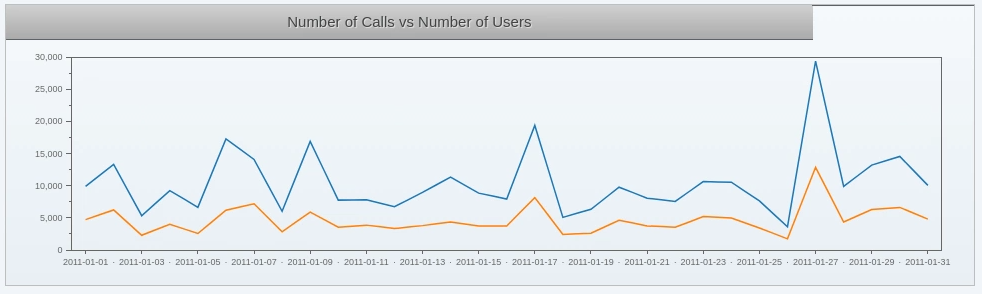
1. From the Components list, expand Charts, and then click CCC Line Chart.
2. Name the line chart, in the Properties pane:
• Click in the Value for the Name property.
• Enter: lineChart.
• Press Tab or Enter.
3. Specify the data source, in the Properties pane:
• Click in the Value for the Datasource property.
• On the keyboard, press the down arrow.
• Select: lineChartQuery.
4. Specify the HTML object, in the Properties pane:
• Click in the Value for the HtmlObject property.
• On the keyboard, press the down arrow.
• Select: lineChartObj.
5. Specify the height for the line chart, in the Properties pane:
• Click in the Value for the Height property.
• Type 220 and press Enter.
6. Delete the width for the line chart, in the Properties pane:
• Click in the Value for the Width property.
• Delete the value and press Enter.
{% hint style="info" %}
Deleting the width does not affect the chart on the dashboard, but it does affect other renderings of it.
{% endhint %}
7. Specify the CCC version, in the Properties pane:
• Click in the Value for the Compatibility version property.
• Type 2 and press Tab or Enter.
8. Save & Preview the dashboard.
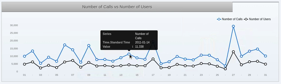
Line Chart
9. Click on Advanced Properties.
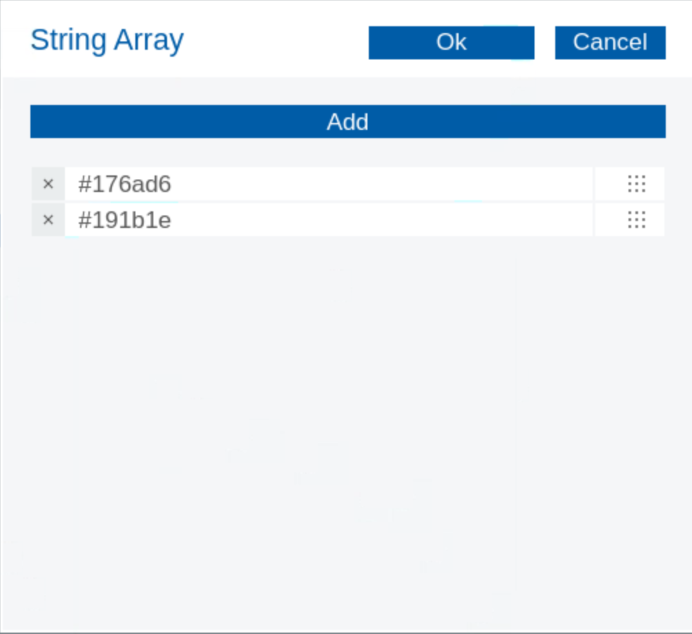
10. Specify the colors for the line chart:
• In the Properties pane, click in the Value column for the colors property.
• In the new window, click the Add button.
• In the text fields, type the following and then click OK:
```
#176ad6
#191b1e
```
Line Chart colours
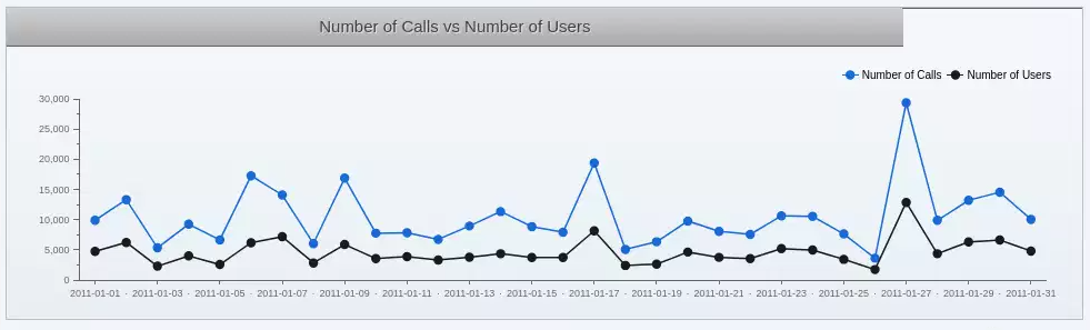
11. Change or set the following advanced properties:
| Property | Value |
| ---------------- | ----- |
| dotsVisible | True |
| legend | True |
| legendAlign | Right |
| legendPosition | Top |
| plotFrameVisible | False |
12. Save & Preview the dashboard.
Advanced Properties
***
#### Extension Point
{% hint style="info" %}
Extension points in Pentaho CTools are predefined locations in the CTools framework where developers can add custom functionality without modifying the core code. They act as hooks that allow you to extend and customize dashboards and components.
The main types of extension points in CTools include:
1. Component Extension Points: Allow you to extend existing components or create new components. These let you add custom properties, modify behavior, or create entirely new visualization types.
2. Dashboard Layout Extension Points: Enable modifications to the dashboard structure and layout system. You can add custom layout types or modify how components are arranged.
3. Lifecycle Extension Points: Hook into different phases of the dashboard lifecycle, such as initialization, refresh, or cleanup. These are particularly useful for adding custom logic that needs to run at specific times.
{% endhint %}
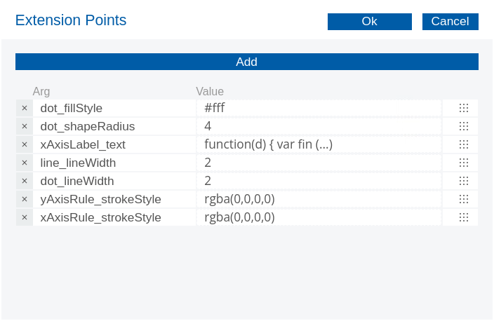
4. Customize the line chart with extension points:
• In the Properties pane, click in the Value column for the Extension Points property.
• In the new window, click the Add button six times.
• Complete the Arg and Value columns with the following, and then click OK:
{% endtab %}
{% endtabs %}
{% endtab %}
{% tab title="Interactions" %}
{% hint style="info" %}
Our dashboard is a bit static ..
Users need to be able to perform drill-downs, select parameter-driven filters, and perform real-time data updates.
Let's say we have a list of Regions that when selected updates the table data based on the Region selected. In CDF language, a parameter which holds the Region values is passed to a Component listener - in this case for a Table Component - which is then
{% endhint %}
{% hint style="success" %}
A component can have more than one parameter in the Listeners property, and a Parameter can be listened by more than one component. Every time the parameter changes, all components that listen to it are updated.
{% endhint %}
{% hint style="info" %}
So we're going to:
• Add parameter components to a dashboard.
• Specify the parameters and listeners for dashboard components.
• Add select (filter) components to a dashboard.
{% endhint %}
{% tabs %}
{% tab title="Parameters & Listeners" %}
{% hint style="info" %}
Let's add some parameters to: pieChartQuery datasource.
{% endhint %}
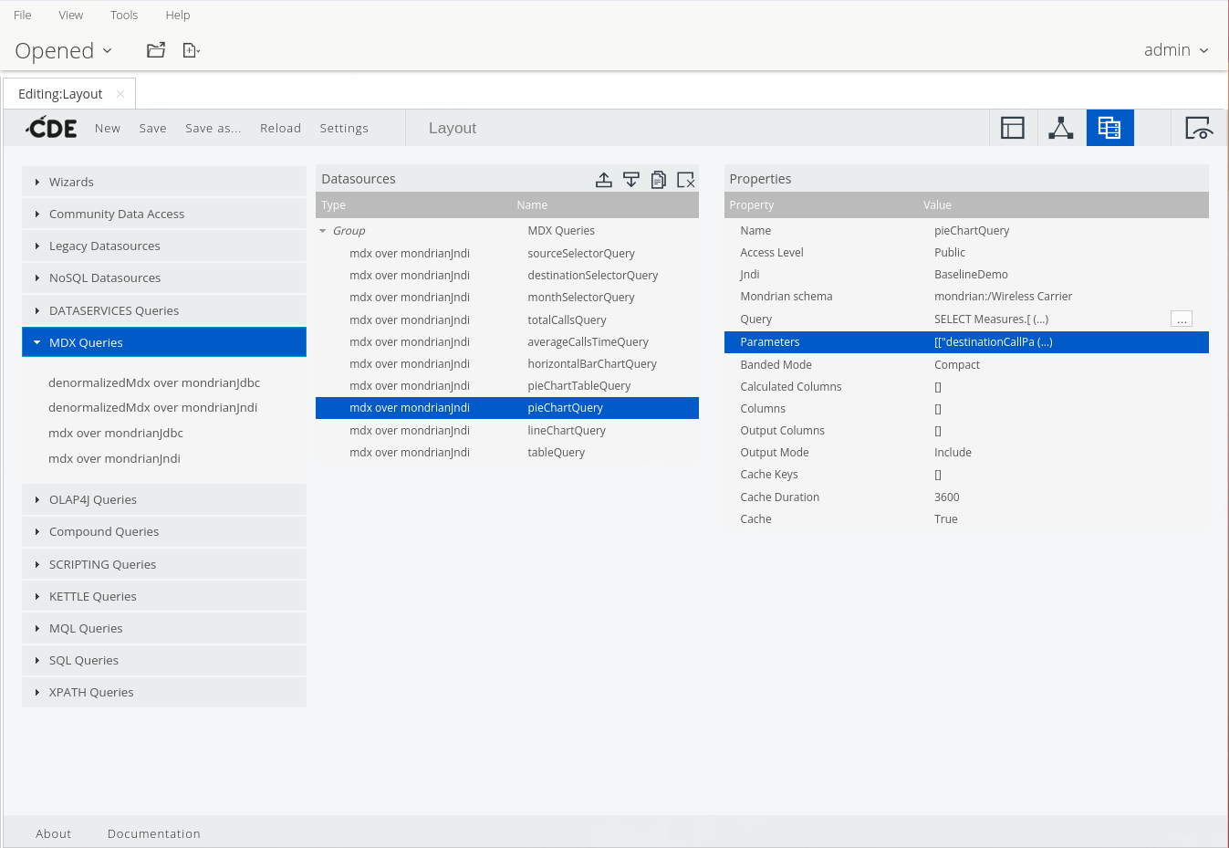
1. Click on the Datasources Panel perspective.
2. Expand the MDX Queries group & select: pieChartQuery.
pieChartQuery
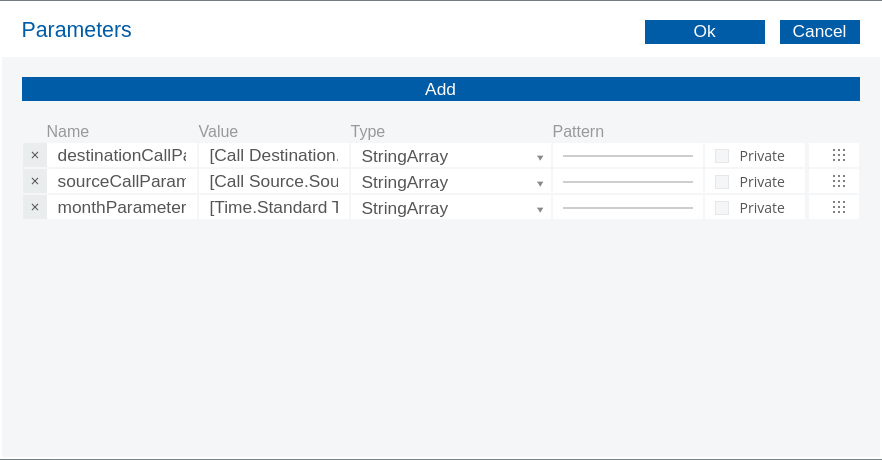
3. View the parameters used in the pieChartQuery, in the Properties pane:
• Click in the Value for the Parameters property.
• Take note of the three parameters.
• Click OK.
pieChartQuery - parameters
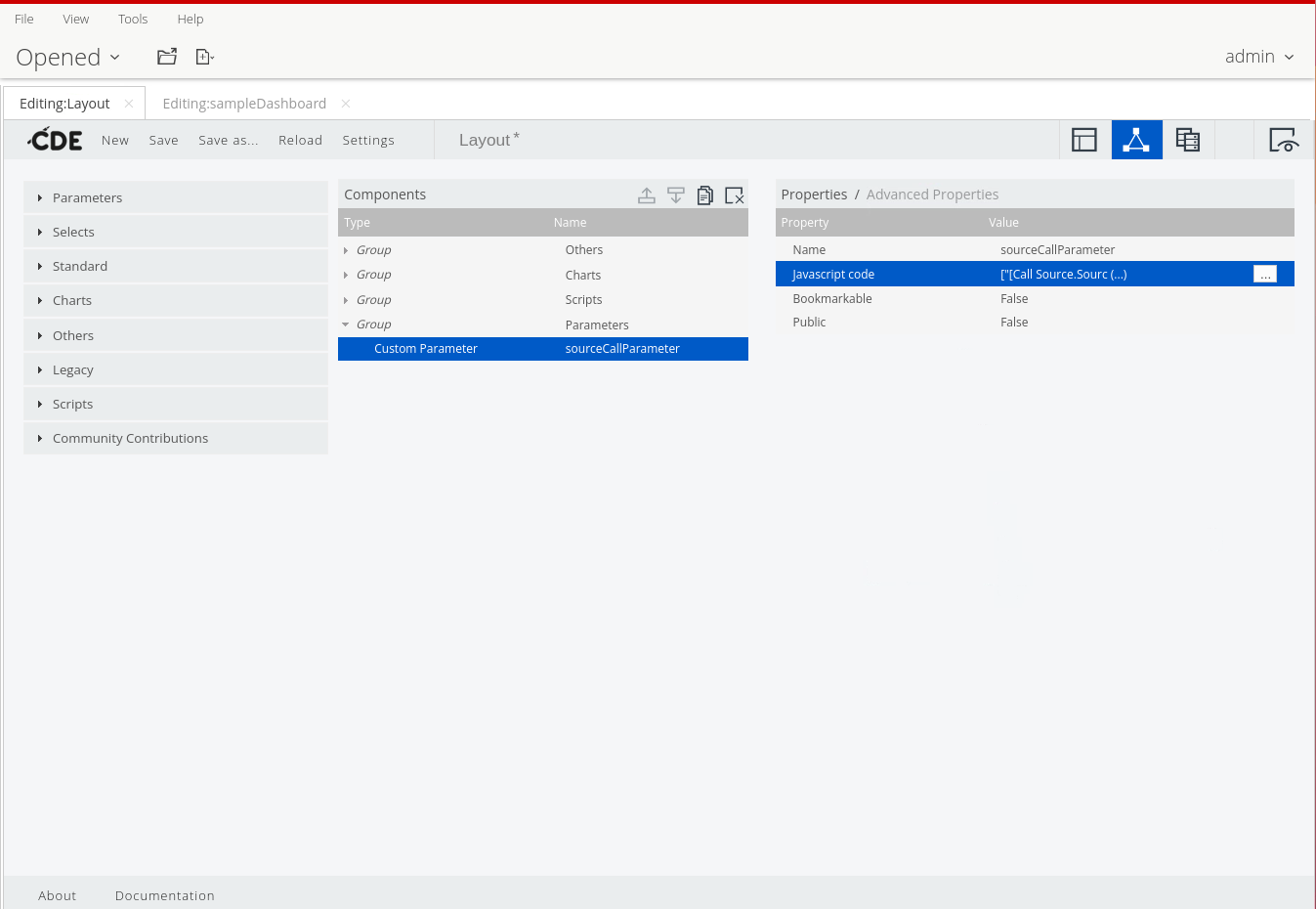
4. Add the sourceCallParameter:
• From the Components list, expand Parameters.
• Click: Custom Parameter.
5. To set the default value, in the Properties pane:
• Click in the JavaScript for the Property value property.
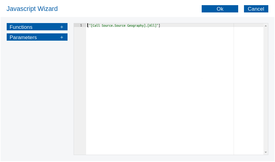
• Type: \[“\[Call Source.Source Geography].\[All]”].
```
["[Call Source.Source Geography].[All]"]
```
• Press Tab or Enter.
6. Add the destinationCallParameter and monthParameter, repeat the previous steps using the following values:
destinationCallParameter
```
["[Call Destination.Destination Geography].[All]"]
```
monthParameter
```
["[Time.Standard Time].[2011].[Q1 2011].[January]"]
```
***
#### Listener
{% hint style="info" %}
Set the parameters and listeners for the pieChart component ..
{% endhint %}
1. In the Components pane, click to expand the Charts group
2. Click: pieChart.
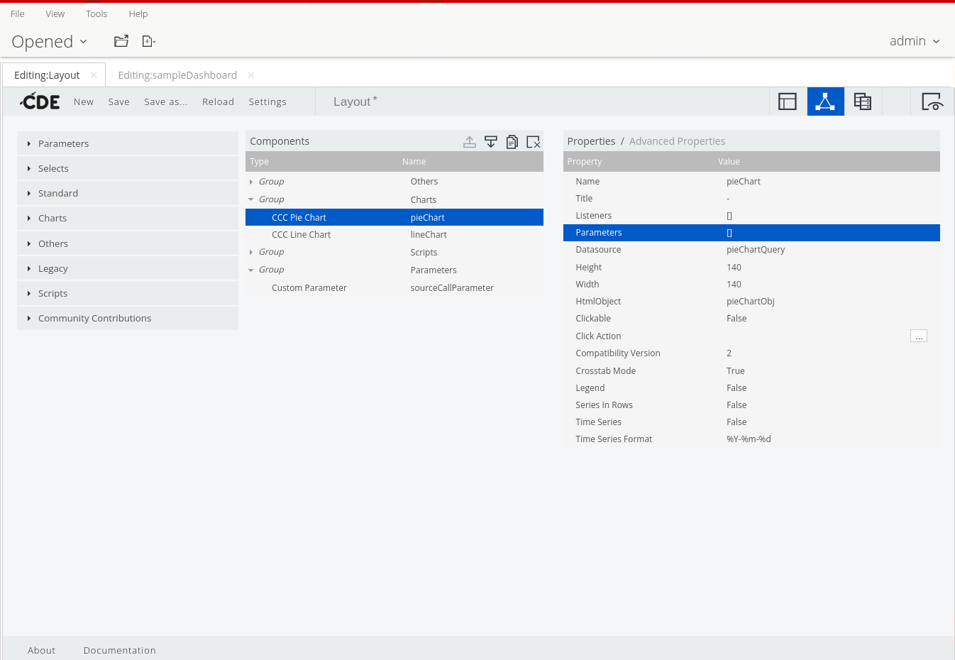
Add parameters to pieChart component
2. To specify the parameters for the pieChart:
• In the Properties pane, click in the Value column for the Parameters property.
• In the new window, click the Add button twice.
• In the first Arg columns, enter: monthParameter.
• Enter the first few letters to select monthParameter.
• Repeat the steps to add the destinationCallParameter and sourceCallParameter, and then click OK.
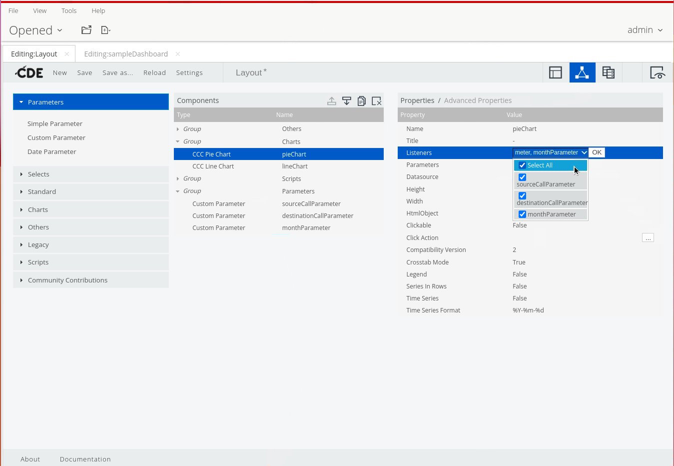
3. Specify the listeners for the pieChart:
• In the Properties pane, click in the Value column for the Listeners property.
• Click the drop-down arrow.
• Click to select the Select All checkbox.
• Click OK.
Add Listeners
{% endtab %}
{% tab title="Selectors" %}
{% hint style="info" %}
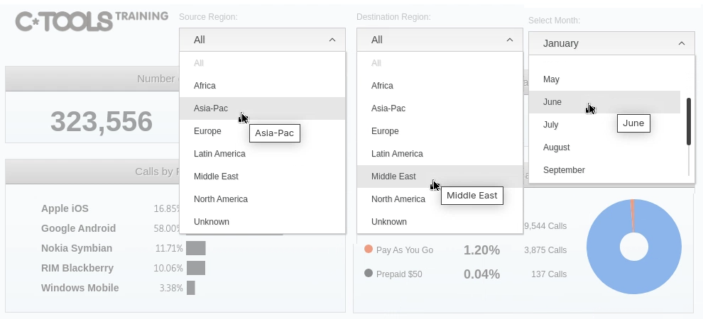
CTools selectors are interactive UI components that allow users to filter and manipulate dashboard data dynamically. They act as user input controls (like dropdown menus, checkboxes, or radio buttons) that can be connected to other dashboard components through parameter bindings.
When a user interacts with a selector, it triggers updates in connected charts, tables, or other visualizations based on the selected values. This provides a way to create interactive, drill-down capable dashboards where users can explore data through different dimensions and filters.
A selector can be a simple textbox where a user type free text, or more elaborated as a select list, a radio button or a date picker.
{% endhint %}
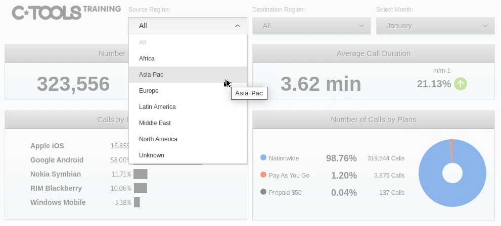
Selectors
1. Add the sourceSelector, from the Components list, expand Selects, and then click Filter Component.
2. Customize the Selector with the following Advanced Properties:
| Property | Value |
| ------------------ | ----------------------- |
| Name | sourceSelector |
| Title | Source Region: |
| Parameter | sourceCallParameter |
| Value as ID | False |
| Datasource | sourceSelectorQuery |
| Show Icons | False |
| Show "Only" Button | False |
| Show Search Filter | False |
| HtmlObject | sourceObj |
| Execute at Start | True |
| Pre Change | see code block below .. |
sourceSelector
```javascript
function f(selectedItem) {
// Get ".children" on MDX if member "All" is selected
if (selectedItem.toString() === "[Call Source.Source Geography].[All]")
this.dashboard.setParameter('sourceChildren', '.Children');
else
this.dashboard.setParameter('sourceChildren', '');
}
```
destinationSelector
```javascript
function f(selectedItem) {
if (selectedItem.toString() === "[Call Destination.Destination Geography].[All]")
this.dashboard.setParameter('destinationChildren', '.Children');
else
this.dashboard.setParameter('destinationChildren', '');
}
```
Month
| | |
| ---------- | ------------------ |
| Name | monthSelector |
| Title | Select Month: |
| Datasource | monthSelectorQuery |
| HtmlObject | monthObj |
3. Save & Preview dashboard.
Selectors
{% endtab %}
{% tab title="clickAction" %}
{% hint style="info" %}
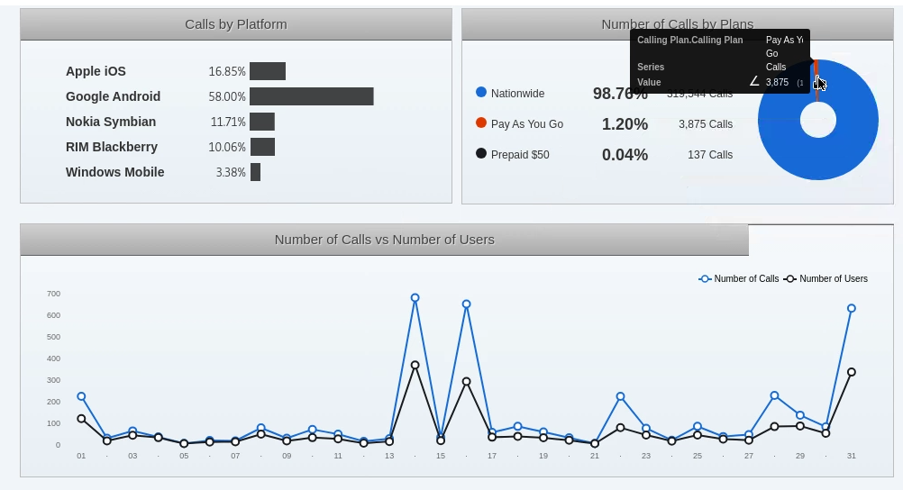
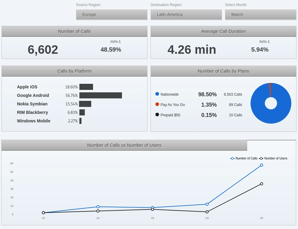
We're going to use the clickAction function on the pieChart to set the value of one parameter (planTypeParameter), to trigger the update of another component (lineChart).
{% endhint %}
Click pieChart to update lineChart
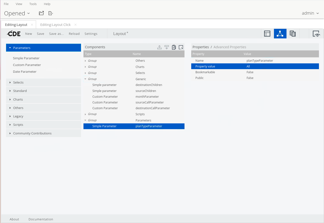
1. From the Components list, expand the Generic group, and then click Simple Parameter.
2. Name the parameter, in the Properties panel:
• Click in the Value field for the Name property.
• Enter: planTypeParameter.
• Press Tab or Enter.
3. To set the default value, in the Properties panel:
• Click in the Value field for the Property value property.
• Type: All.
• Press Tab or Enter.
4. Save the dashboard.
Add planTypeParameter
{% hint style="info" %}
Now we need to add the parameter - PlanTypeParameter - to the lineChartQuery.
{% endhint %}
5. In the Datasources pane, expand the MDX Queries group, and then click to select the lineChartQuery.
6. To change the MDX query:
• In the Properties pane, click the ellipsis icon to the right of the Query property.
• In the Sql Editor window, replace the existing text with the following MDX query, and then click Ok.
```sql
WITH
SET DAYS AS DESCENDANTS(${monthParameter}, 1)
MEMBER [Calling Plan].[Selected Plan Type] as Aggregate( [Calling Plan].[${planTypeParameter}] )
SELECT
DAYS ON 1,
{[Measures].[Calls], [Measures].[Users]} ON 0
FROM
[Call Corridor]
WHERE
(${sourceCallParameter}, ${destinationCallParameter}, [Calling Plan].[Selected Plan Type])
```
{% hint style="info" %}
Last few steps:
Add the planTypeParameter to the datasource
Enable - True - Clickable in pieChart component
Add listener
{% endhint %}
7. Add the new parameter and specify its default value:
• In the Properties pane, click in the Value field for the Parameters property.
• In the new window, click the Add button once.
• In the Name column, enter: planTypeParameter.
• In the Value column, enter: All.
• Click Ok.
8. In the Components pane, expand the Charts group, and then click to select the pieChart component.
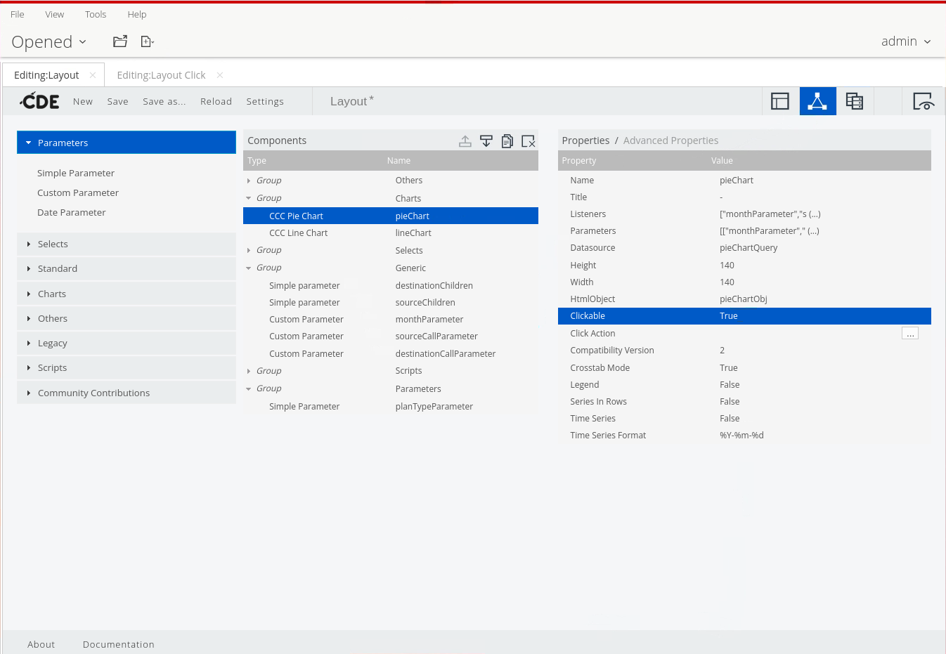
9. Enable the clickable functionality, in the Properties pane:
• Click in the Value field for the clickable property.
• On the keyboard, press the down arrow.
• Select True.
Clickable
10. To specify the clickAction function that will trigger the update:
• Click the ellipsis icon to the right of the clickAction property.
• In the Javascript Wizard window, enter the following code, and then click OK:
```javascript
function f(scene) {
var vars = scene.vars;
var c = vars.category.value;
var v = vars.value.value;
Logger.log("Clicked on Category '" + c + "' , which has a Value of: " + v);
dashboard.fireChange('${p:planTypeParameter}', c);
}
```
{% hint style="info" %}
Inside the clickAction function we call dashboard.fireChange (param, value) with the name of the parameter to change and the new value for that parameter.
When a user clicks on a mark (a slice of pie, in this case), the above function is triggered (which triggers the update of all the components that listen to that parameter).
{% endhint %}
11. In the Components pane, expand the Charts group, and then click to select the lineChart component.
12. Add the extra listener for the lineChart:
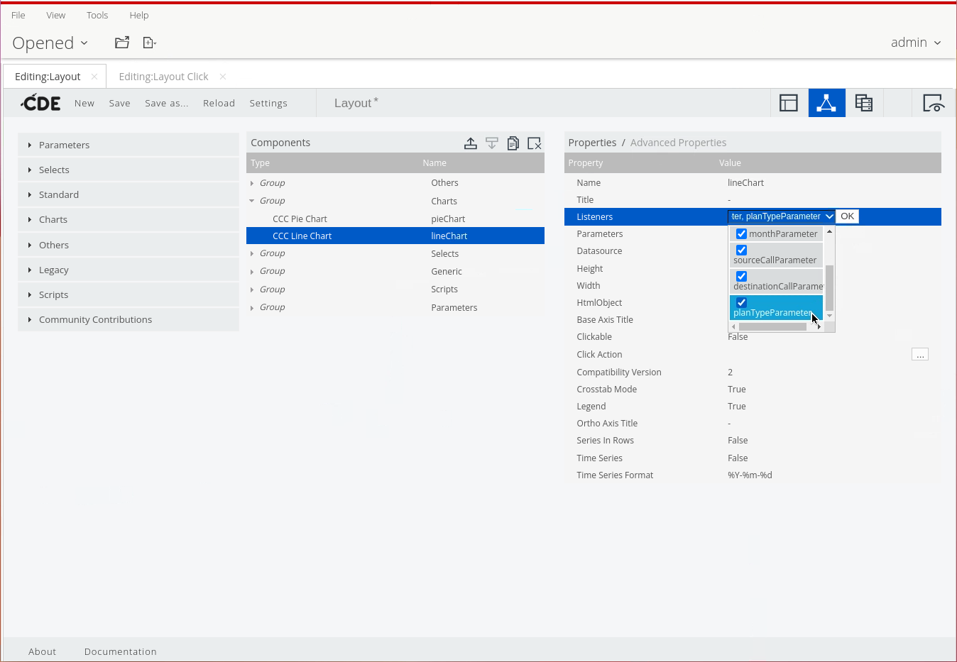
• In the Properties pane, click in the Value column for the Listeners property.
• Click the drop-down arrow.
• Click to select the planTypeParameter checkbox.
• Click OK.
Add planTypeParameter listener.
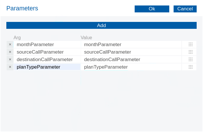
13. Select the extra parameter for the lineChart:
• In the Properties pane, click in the Value for the Parameters property.
• In the new window, click the Add button once.
• In the Arg column, type planTypeParameter.
• Click the ellipsis, and then from the Choose Parameter window, click to select planTypeParameter.
• Click Ok.
Add planTypeParameter to lineChart
14. Save & preview the dashboard.
Interactive pieChart
{% endtab %}
{% tab title="Export" %}
{% hint style="info" %}
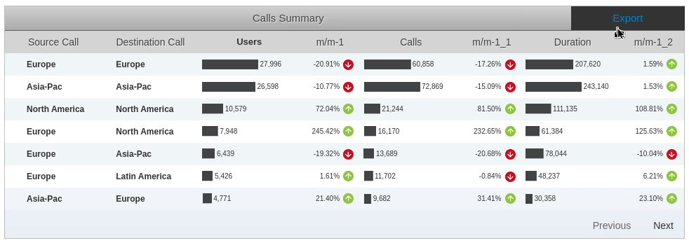
The final part is to leverage CDE export functionality to export charts and the main table.
The data can be exported in several formats, like CSV, XLS, XML and JSON (through CDA API calls done in the background).
If we have CDE/CCC chart components on our dashboard, we can also export the charts as PNG and SVG files (through CGG).
There's two components to add:
• Export Button Component– use this when you only need to export the data in one specific format (CSV, XLS, XML or JSON).
• Export Popup Component – use this when you need to export chart images (PNG and/or SVG format) or when you want to export the data in more than one format (CSV, XLS, XML and/or JSON).
{% endhint %}
Export Options
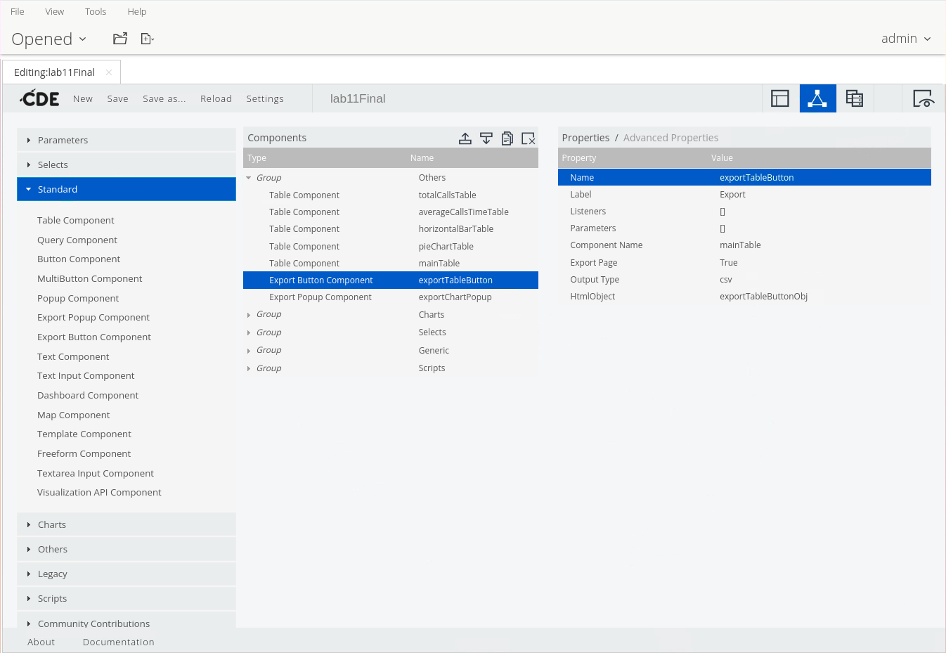
1. To add the exportTableButton, from the Components list, expand Standard.
2. Select: Export Button Component.
Export Button Component
1. Name the export button, in the Properties pane:
• Click in the Value for the Name property.
• Enter: exportTableButton.
• Press Tab or Enter.
4. To set the label of the export button, in the Properties pane:
• Click in the Value for the Label property.
• Enter: Export.
• Press Tab or Enter.
5. To define from which component we want to export the data, in the Properties pane:
• Click in the Value for the Component Name property.
• Enter: mainTable.
• Press Tab or Enter.
6. To select the HTML object, in the Properties pane:
• Click in the Value for the HTML Object property.
• On the keyboard, press the down arrow.
• Select: exportTableButtonObj.
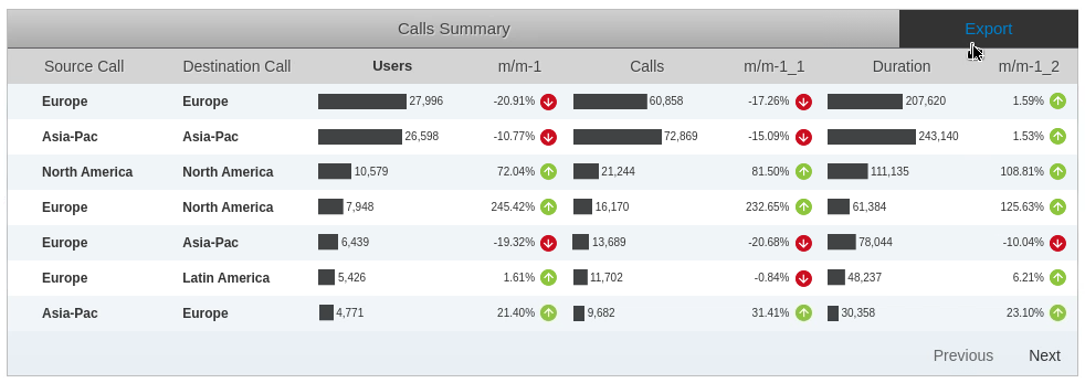
7. Save & preview the dashboard.
Export table - CSV
***
Export Popup
{% hint style="info" %}
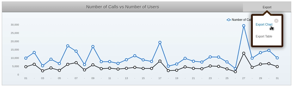
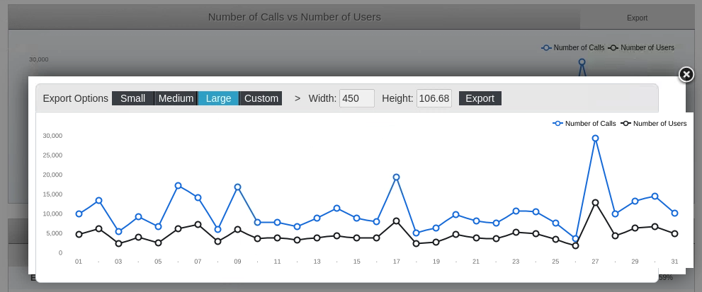
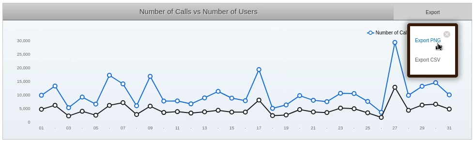
In the final part of this workshop we're going to add an ExportPopupComponent to export the Number of Calls vs Number of Users chart (lineChart) data in CSV and PNG.
{% endhint %}
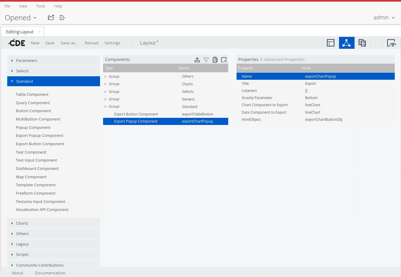
1. To add the exportChartPopup, from the Components list, expand Standard.
2. Select: ExportPopupComponent.
exportChartPopup Component
3. To name the export button, in the Properties pane:
• Click in the Value for the Name property.
• Enter: exportChartPopup.
• Press Tab or Enter.
4. Set the label of the export button, in the Properties pane:
• Click in the Value for the Title property.
• Enter: Export.
• Press Tab or Enter.
5. Define from which chart component we want to export the image, in the Properties pane:
• Click in the Value for the Chart Component to Export property.
• Enter: lineChart.
• Press Tab or Enter.
6. Define from which component we want to export the data, in the Properties pane:
• Click in the Value for the Data Component to Export property.
• Enter: lineChart.
• Press Tab or Enter.
7. Select the HTML object, in the Properties pane:
• Click in the Value for the HTML Object property.
• On the keyboard, press the down arrow.
• Select exportChartButtonObj.
8. Save the dashboard.
{% hint style="info" %}
To use the export popup, we must view the dashboard (not Preview).
{% endhint %}
9. Open the dashboard, from the Browse Files perspective - Carrier-Dashboard-Export
Export - Chart or Table
Export Chart
{% hint style="info" %}
The Table is currently being exported as .xls. Let's change this to .csv
{% endhint %}
10. Change or set the following advanced properties:
| Property | Value |
| ------------------------------- | -------------------- |
| Chart Export Label | Export PNG |
| Data Export Type | csv |
| Data Export Label | Export CSV |
| Name for Data Export attachment | NrofCallsVsUsers |
| Post Execution | see code block below |
```bash
function f() {
// Remove the arrow element
$('.popupComponent div.arrow').remove();
}
```
11. Save and open dashboard in Browser.
Export - PNG & CSV
{% endtab %}
{% tab title="Expand" %}
{% hint style="info" %}
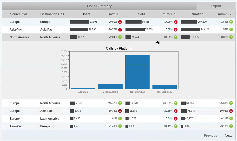
One of the neat features that can be added is .. expanding rows.
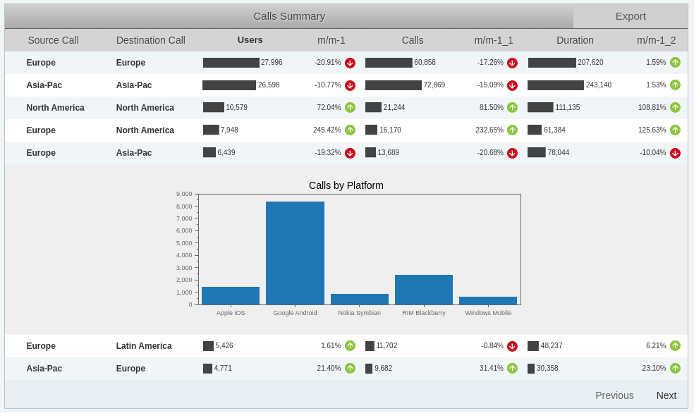
So if you click on a row in the mainTable, the record will expand and display a barChart - Calls by Platform.
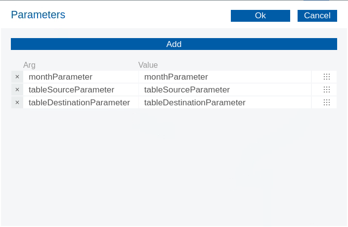
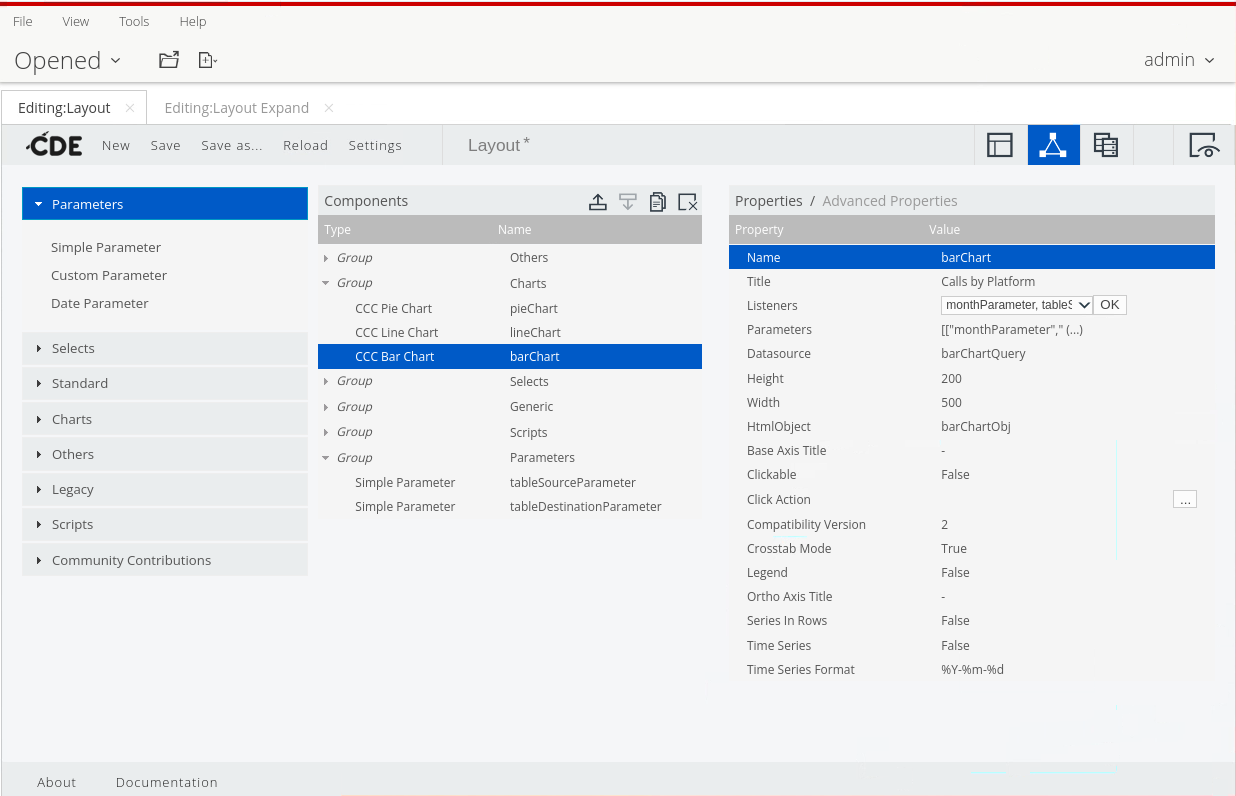
The barChart has 3 parameters & listeners - monthParameter, tableSourceparameter, tableDestinationParameter.
{% endhint %}
Expand a record
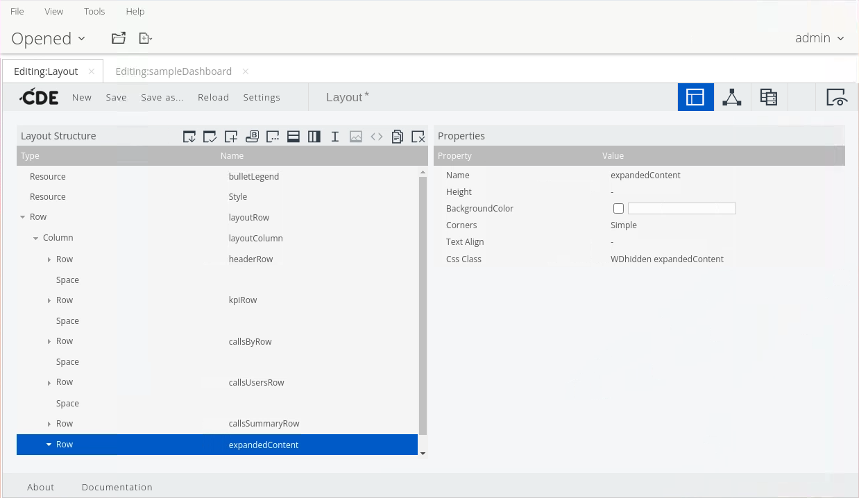
1. To add a main row that will encapsulate the content to be displayed on the expanded row, in the Layout Structure panel:
• Select the layoutColumn column under the layoutRow row.
• Click in the Add Row icon.
2. Name the row, in the Properties panel:
• Click in the Value field for the Name property.
• Enter: expandedContent.
• Press Tab or Enter.
Add row - expandedContent
3. Assign CSS classes to the expandedContent row, in the Properties panel:
• Click in the Value field for the Css Class property.
• Enter: WDhidden expandedContent.
• Press Tab or Enter.
6. Add a column for the displayed bar chart, with the expandedContent row selected, click the Add Columns icon.
7. Name the column, in the Properties panel:
• Click in the Value field for the Name property.
• Enter: barChartObj.
• Press Tab or Enter.
***
#### Data Source
{% hint style="info" %}
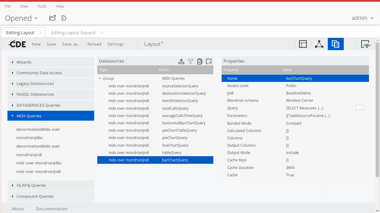
Need to create a barChartQuery to populate the barChart ..
{% endhint %}
barChartQuery
1. Click the Datasources Panel icon.
2. Expand MDX Queries, and select: mdx over mondrianJndi.
3. Name this data source, in the Properties pane:
• Click in the Value for the Name property.
• Enter: barChartQuery.
• Press Tab or Enter.
4. Select the BaselineDemo jndi connection, in the Properties pane:
• Click in the Value for the Jndi property.
• On the keyboard, press the down arrow.
• Select: BaselineDemo connection.
5. Select the Wireless Carrier Mondrian schema, in the Properties pane:
• Click in the Value for the Mondrian schema property.
• On the keyboard, press the down arrow.
• Select: Wireless Carrier schema.
6. Enter the MDX query:
• In the Properties pane, click the ellipsis icon to the right of the Query property.
• In the MDX Editor window, enter the following MDX query, and then click Ok.
```
SELECT
Measures.[Calls] on 0,
[Platform].[Platform].members on 1
FROM [Call Corridor]
WHERE
(
${monthParameter},
[Call Source.Source Geography].[${tableSourceParameter}],
[Call Destination.Destination Geography].[${tableDestinationParameter}]
)
```
7. Save the dashboard.
***
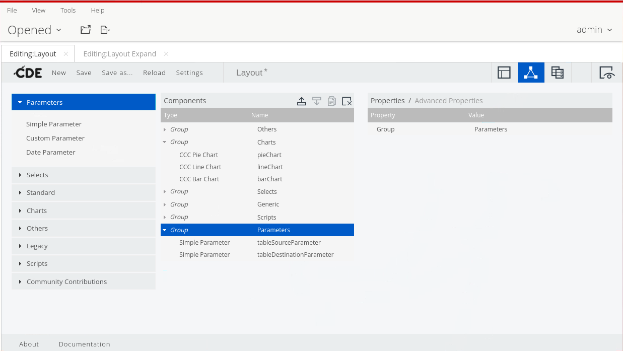
Parameters
{% hint style="info" %}
Finally we need to pass some parameters - filters - based on:
Source
Destination
Month
{% endhint %}
1. Add the parameters and specify default values:
• In the Properties pane, click in the Value column for the Parameters property.
• In the new window, click the Add button twice.
• In the Name and Value columns, type the following, and then click Ok.
Parameters - barChart
Name
Value
tableSourceParameter
All
tableDestinationParameter
All
monthParameter
[Time.Standard Time]. [2011].[Q1 2011].[January]
2. From the Components list, expand Parameters, and then click Simple Parameter.
Listeners
3. Name the parameter, in the Properties pane:
• Click in the Value for the Name property.
• Enter: tableSourceParameter.
• Press Tab or Enter.
4. Set the default value, in the Properties pane:
• Click in the Value for the Property value property.
• Enter: All.
• Press Tab or Enter.
5. Repeat the previous three steps to add: tableDestinationParameter and set the default value to All.
6. Save the dashboard.
***
#### Chart
{% hint style="info" %}
Finally .. configure the Chart & Listener components.
{% endhint %}
1. Click the Components Panel icon.
2. From the Components list, expand Charts, and then click CCC Bar Chart.
Add Listeners
1. Name the bar chart, in the Properties pane:
• Click in the Value for the Name property.
• Enter: barChart.
• Press Tab or Enter.
4. Add a title for the bar chart, in the Properties pane:
• Click in the Value for the Title property.
• Type Calls by Platform.
• Press Tab or Enter.
Add Listeners
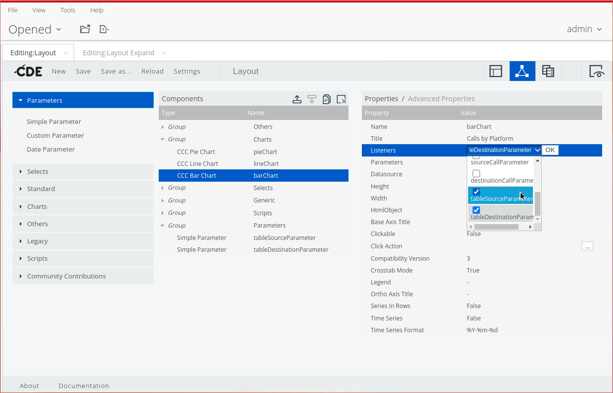
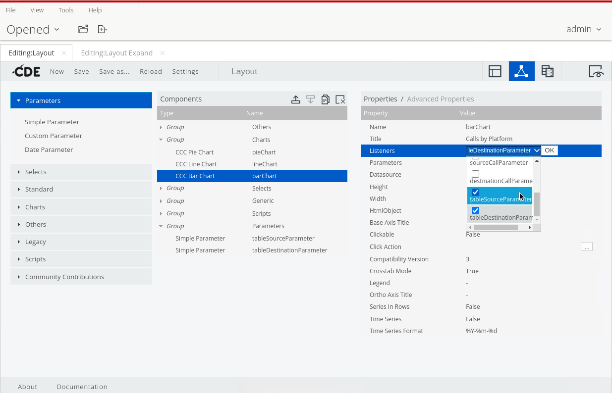
5. Specify the listeners for the barChart:
• In the Properties pane, click in the Value column for the Listeners property.
• Click the drop-down arrow.
• Click to select: monthParameter, tableSourceParameter, and tableDestinationParameter checkboxes.
• Click OK.
6. Specify the parameters for the barChart:
• In the Properties pane, click in the Value column for the Parameters property.
• In the new window, click the Add button twice.
• In the first Arg columns, type monthParameter.
• Enter the first few letters of monthParameter.
• Repeat the steps to add the tableSourceParameter and tableDestinationParameter, and then click OK.
Parameters to pass to datasource
7. Specify the data source, in the Properties pane:
• Click in the Value for the Datasource property.
• On the keyboard, press the down arrow.
• Select: barChartQuery.
8. Specify the width and height for the pie chart, in the Properties pane:
• Click in the Value for the Height property.
• Type: 200 and press Enter.
• Click in the Value for the Width property.
• Type: 500 and press Enter.
9. Specify the CCC version, in the Properties pane:
• Click in the Value for the Compatibility version property.
• Type: 2.
• Press Tab or Enter.
10. Specify the HTML object, in the Properties pane:
• Click in the Value for the HtmlObject property.
• On the keyboard, press the down arrow.
• Select: barChartObj.
11. Disable the legend, in the Properties pane:
• Click in the Value for the Legend property.
• On the keyboard, press the down arrow.
• Select: False.
Properties
***
#### Advanced Properties
1. Click Advanced Properties.
2. Set the execute at start flag, in the Properties pane:
• Click in the Value for the Execute at start property.
• On the keyboard, press the down arrow.
• Select: False.
{% hint style="info" %}
When a dashboard is loaded all its components are instantiated. The Execute at start property determines for each component if it should be executed or not at that moment. If the Execute at start flag of a component is False, the component will not be rendered.
{% endhint %}
3. Save the dashboard.
***
#### Enable mainTable
{% hint style="info" %}
Finally .. enable the Expand option in the mainTable.
{% endhint %}
Enable mainTable
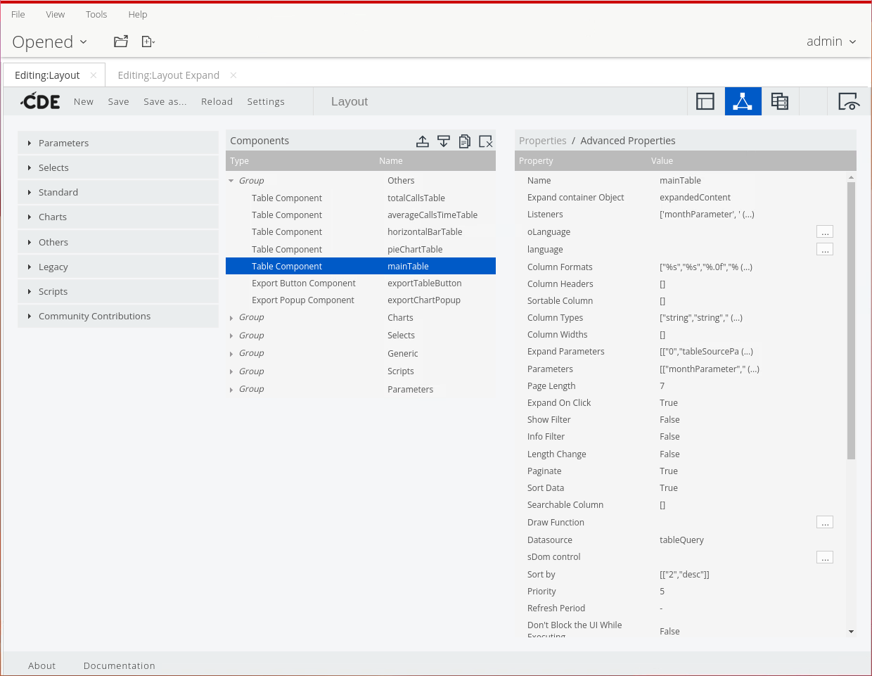
1. From the Components list, expand Others, and then click the mainTable component.
2. In the Properties pane, click Advanced Properties.
3. Set the expand on click property, in the Properties pane:
• Click in the Value for the Expand on Click property.
• On the keyboard, press the down arrow.
• Select: True.
4. Specify the object that encapsulates the content on the expand row, in the Properties pane:
• Click in the Value for: Expand container Object property.
• Enter: expandedContent.
• Press Tab or Enter.
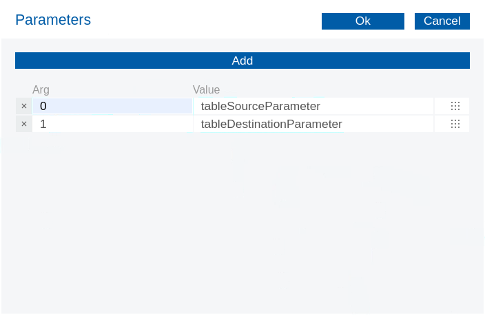
5. Specify the parameters that will carry the column values to be passed to the expanded content:
• In the Properties pane, click in the Value column for the Expand Parameters property.
• In the new window, click the Add button.
• In the first Arg column, type 0.
• Enter the first few letters to select: tableSourceParameter.
• In the second Arg column, type 1.
• Enter the first few letters to select: tableDestinationParameter.
• Click OK.
{% hint style="info" %}
The Arg column contains the column index and the Value column refers to the name of the parameter that stores its values.
{% endhint %}
6. Save & Preview the dashboard.
Calls by Platform
{% endtab %}
{% endtabs %}
{% endtab %}
{% endtabs %}
---
# Agent Instructions
This documentation is published with GitBook. GitBook is the documentation platform designed so that both humans and AI agents can read, navigate, and reason over technical content effectively. Learn more at gitbook.com.
## Querying This Documentation
If you need additional information that is not directly available in this page, you can query the documentation by asking a question.
Perform an HTTP GET request on the following URL with the `ask` and `goal` query parameters:
```
GET https://academy.pentaho.com/pentaho-ctools/c-tools/community-dashboard-editor/components/carrier-dashboard.md?ask=&goal=
```
`ask` is the immediate question: it should be specific, self-contained, and written in natural language.
`goal` is what the user is ultimately trying to achieve, the reason they need the answer. Sharing it helps GitBook give you a better, more relevant answer. A goal is most helpful when it describes the outcome the user wants rather than restating the question. For example, with `ask=how do I create an API token`, a goal like `automate deployments from our CI pipeline` lets GitBook tailor the answer to that use case.
The response will contain a direct answer to the question and relevant excerpts and sources from the documentation.
Use this mechanism when the answer is not explicitly present in the current page, you need clarification or additional context, or you want to retrieve related documentation sections.